[x]
All Deviations

dc interface me contest by ~tul:icontul:


©2006-2008 ~tul
Details
Submitted: November 23, 2006
File Size: 580 KB
Image Size: 580 KB
Resolution: 1000×1100
Comments: 25
Favourites & Collections: 18 [who?]

Views
Total: 2,202
Today: 0

Downloads
Total: 56
Today: 0

Thumb

Artist's Comments

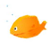
Okay, I don't expet to win with this, but here is the submission for *designerscouch's interface me contest, ending today.
Started this two days ago, finished this today. Something new, hope you like it :P
[x]

Devious Comments

love 0 0 joy 1 1 wow 0 0 mad 0 0 sad 0 0 fear 0 0 neutral 0 0

~Skyrail:iconSkyrail: Nov 23, 2006, 2:22:52 PM
I r teh awesome...oh wait, IT r teh awesome ;) :+fav:

--
| *DesignersCouch :couch: | MS−DOS = Microsoft Seeks Domination Over Society
~deanhydeist:icondeanhydeist: Nov 23, 2006, 7:22:22 PM
nice design...hope u win that contest..:)

--
+ d o r e a l . m a k e b e l i e v e +
| w w w . a r t - d i c t e d . c o m |
`depthskins:icondepthskins: Nov 23, 2006, 7:56:22 PM
liking the logotype alot. That's really cool. It's a nice design. I think that you should focus some more on alignment of the type. Nice work tho :D

--
Creative Director | Depthskins Design Studio
~perfectionality:iconperfectionality: Nov 24, 2006, 12:37:45 AM
Well...I like it in the sense that it's simple and effective. The colours are extremely well placed, as always...although I'd go for a little more complexity.

--
Perfection comes by chance, not by intentions.
~chanaka:iconchanaka: Nov 24, 2006, 3:04:56 AM Mood: Joy
nice work :)

--
Visit my :gallery: and leave ur comments
+-~-+-~-+-~-+-~-+-~-+-~-+-~-+-~-+-~-+
~tul:icontul: Nov 24, 2006, 6:53:24 AM
WHat do you mean alignment of the type
Thanks =)

--
:D+:D+:D=:O? Click Here for Answer
*designerscouch
~tul:icontul: Nov 24, 2006, 6:58:52 AM
Yeah, its a little straight forward, thanks for the comment

--
:D+:D+:D=:O? Click Here for Answer
*designerscouch